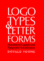
| LOGOTYPES & LETTERFORMS: HANDLETTERED LOGOTYPES AND TYPOGRAPHIC CONSIDERATIONS By Doyald Young |
|||||||
|
|
|||||||
| Occasionally, events or circumstances prevent a book from enjoying the exposure and distribution that other published works receive. This is one of those books. The imprint ‘Design Press’ was closed by an acquiring publisher and if it weren’t for the promotional efforts of the author, Doyald Young, you may never have heard of this book.
For those like me who didn’t attend the Art Center College of Design in Pasadena, California, and weren’t fortunate enough to have been one of Young’s pupils, this book is the next best thing. However, this would have to be considered an advanced course, with the prerequisites being a working knowledge of typography and lettering. Logotypes & Letterforms showcases Young’s work from the first 35 years of his career. The book is divided into chapters by subject, each with its own opening essay by the likes of Colin Brignall, Allan Haley, et al. Each project is presented with informative descriptions, some including preliminary sketches or rejected design approaches. Most studies are accompanied by thoughtful references to typefaces that either provided a model on which the design was based, or simply share similar features. This is where Young’s talent as an educator becomes apparent—his ability to give a full account of a given project, including the tiniest details, is exceptional.
Young’s commercial work is tempered by the needs of his clientele and as a result is sometimes too conservative. Despite this, all his work exemplifies a clear understanding of letterform history and a skillful, intelligent application of his own ideas. Young’s work displays a level of technical proficiency (take note, his work is all hand-drawn) rarely seen in younger designers today. This is evident in the penciled roughs confidently presented (sometimes almost indistinguishably) alongside finished pieces. With the exception of a smattering of digital typefaces he created, no computers were used.
Were it only a retrospective of Young’s work, as it appears upon first glance, Logotypes & Letterforms would still be worthy of praise. But elegantly embedded throughout the project descriptions are the true gems—a collection of his thoughts on the creation, use and life of logos, logotypes, and letterforms on the whole. For this reason I would recommend taking in the book at short intervals so as to give each study your full attention. It’s easy to miss something like his direct statement that “...a logotype and typography’s first requirement is legibility.” (p.43) when a huge, remarkably beautiful masthead sporting a CAS ligature and based on a mix of Bodoni and Didot has captured your interest. —Delve Withrington |
|
||||||
Logotypes & Letterforms: Handlettered Logotypes and Typographic Considerations Author: Doyald Young Publisher: Design Press/McGraw-Hill [1993] ISBN: 0-8306-3956-X Binding: Hardcover, 320pp. 8 1/2" x 11" |
|||||||
© Copyright 1997–2002 TypeBooks |
|||||||
