| INTERVIEW WITH ROBERT
BRINGHURST Author of The Elements of Typographic Style |
|||
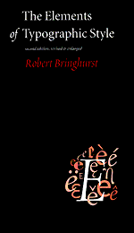
It has been called ‘The Typographers Bible’ by the likes of Hermann Zapf—and with good reason. The Elements of Typographic Style is the authoritative and masterful work on typography by poet and writer, Robert Bringhurst. Furthermore, Elements was also top choice in the 1997 and 1998 reader surveys conducted by TypeBooks. The second edition was just hitting the bookstore shelves as this interview was conducted. |
|||
| TB: | Congratulations on the success of your book. It seems to be a mainstay for many people in the design industry and it turned out to be number one in TypeBooks’ survey as well. What do you think of the widespread acceptance of your work? |  |
|
RB: |
The book has had a very warm reception from people in many countries, and this pleases me immensely. It pleases me because, strange as it may sound, wide acceptance is something that I hoped for, but it isn’t what I aimed for. I just sat down and tried to write the best book I could write about the basics of typography. I followed what seemed to me the best ideas and the best examples, old and new, wherever they led me, and I said what I wanted to say, instead of cynically trying to say only the things I thought the market wanted to hear. It’s quite delightful to learn that one can sometimes still succeed by such a simple-minded method. |
||
TB: |
What changes were made to this latest edition? |
||
RB: |
The second edition, to my surprise, is 96 pages longer than the first. There are more historical examples, and the discussion of typographic history is brought more closely up to date. In chapter 10—which is, in effect, an annotated specimen book—I added a lot of fonts, and I added more background information. There’s also a new chapter dealing with issues such as Unicode, GX fonts, typography for the Web, and other issues that weren’t discussed at all in the earlier edition. Buried in chapter 6, there’s a whole new section on polyglot typography as well. The appendices are longer, and two of them are new. The list of special characters is longer and has better illustrations. The glossary is longer. The list of type designers is longer. There is a new list of foundries, both digital and metal. And the index is much more extensive than it was. It looks like the same book, but there’s actually a good deal more meat on the bone. |
||
|
TB: | Do you have any plans for a new book? | ||||
RB: |
I have plans for dozens of books and several that are under way. What writer doesn’t? |
|||||
TB: |
What are they about? |
|||||
RB: |
I think that books, like people, are better off not being talked about behind their backs. Before they are finished, books are all back. After they are published, people, including the author, can say what they please. |
|||||
| TB: | What is your impression of type’s use in digital media vs. traditional media? | |||||
RB: |
One of the sentences in the first edition of Elements that remains unchanged in the second edition is this: “Typography at its best is sometimes as good, and at its worst is just as bad, as it ever was.” Digital type is different from metal type, like watercolor is different from painting in oils. But people who really want to do beautiful work find ways to do it, whatever the medium they use. |
|||||
TB: |
What do you think of the US Copyright Office’s current policy denying the copyright of typefaces? |
|||||
RB: |
I’m thoroughly convinced that copyright protection for type designs would benefit everyone concerned—readers, type designers, typefounders, typographers, and publishers. Expert witnesses would have to be called when cases went to trial, but that is normal practice now in many fields of law. And type has been around for a long time. In type design as in literature, the genuine classics would be in the public domain. No one’s freedom of speech would be impaired by a law that offered type designs protection of the same kind now given to photographs and poems. |
|||||
TB: |
Do you foresee any kind of change with more powerful type and design tools being made more accessible and affordable? |
|||||
RB: |
The most powerful type and design tools in the world are the pencil and the pen, which have been pretty accessible and affordable for quite a while. Some people, it is true, are so enchanted by the computer that they now can’t draw or write by hand, just as some are so enchanted by the car that they’re incapable of walking. And a few people are vandals, who will use whatever tools they have to wreck what other people do. But the tools aren’t to blame for these defects of character. |
|||||
| TB: | In your opinion, what new developments or trends in the design industry look promising, if any? |  |
|
RB: |
Many exciting things are happening in type design. There are, for instance, technical developments that make large character sets easier to handle, and alternate characters and ligatures easier to use. These technical developments are largely driven by the desire to sell computers to people who don’t use the Latin alphabet. As a side-effect, we are getting, at last, the necessary tools for good multilingual digital typography. So far as type design itself is concerned, some sweet pretypographic letterforms are finally achieving typographic form. Matthew Carter’s Sophia is one example. Adrian Frutiger’s Herculanum is another. I find the rediscovery of Carolingian scripts—which predate the division between roman and italic—very exciting too. The two best Carolingian faces I can think of are the second roman of Konrad Sweynheim & Arnold Pannartz, finished in 1467, and Gudrun Zapf von Hesse’s Alcuin, which was finished in 1991. Then there is a whole new genus of typefaces based on 20th-century architectural scripts. David Siegel’s Tekton and Eaglefeather are both superb examples—one based on the architectural lettering of Frank Ching, the other based on the hand of Frank Lloyd Wright. There are some fine new script fonts based on Renaissance letterforms too. Robert Slimbach’s Sanvito, for example. Scribal letters have their roots in two dimensions, not in the 3-D world of letterpress. Modern printing techniques are two-dimensional too. These new script faces—which are legible and clean enough for setting entire books—can flourish within the limitations of contemporary printing, where forms intended for letterpress usually suffer. |
||
TB: |
In your opinion, what developments or trends in the design industry look dangerous? |
||
RB: |
The same developments and trends that look dangerous elsewhere: namely, ignorance and greed. The cult of personality and power, and the religion of money. These diseases are as visible in the typographic world as they are in the world of politics. The very fact that there is such a thing as a design industry is dangerous. Industries develop momentums and agendas of their own, and they rearrange the world at an other-than-human scale. But, to return to the previous question, one very promising sign in the typographic world is that many people do still work on a cottage-industry scale. Cottages are fit for human habitation. Parking lots and office towers aren’t. |
||
 |
TB: | Do you make use of the Internet? If so, how? |
RB: |
I use it to communicate quickly with specific people of my choosing, not to gorge on news or ersatz information. |
|
TB: |
What are your likes or dislikes about the Internet? |
|
RB: |
The Internet’s merits are, of course, its speed and (for now) its largely noncommercial nature. As a domain for typography, it’s very disappointing. But we all know the ‘Net is likely to change, both for the better and for the worse. |
|
TB: |
Is there something you would like to say to any aspiring designers that may be reading this? |
|
RB: |
I’d like to say: hello, and though it might sound mawkish, I’d like to say: keep on aspiring. In other words, keep breathing and keep looking for good air. The masters of the art, it seems to me, are those who never stop apprenticing. |
|
TB: |
Thank you for your time Mr. Bringhurst. It’s been a pleasure. —Delve Withrington, |
|
| Elements of Typographic Style, The* (2nd Ed.) Author: Robert Bringhurst Publisher: Hartley & Marks [1997] ISBN: 0-88179-132-6 (PB) Binding: Paperback, 350pp. ISBN: 0-88179-133-4 (HC) Binding: Hardcover, 320pp. |
||
Thanks also to Hartley & Marks, Publishers for their cooperation. © Copyright 1997–2002 TypeBooks |
||