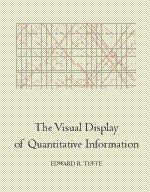
| THE VISUAL DISPLAY OF QUANTITATIVE INFORMATION By Edward Tufte |
|||||||
“Graphical excellence is the well-designed presentation of interesting dataďż˝a matter of substance, of statistics, and of design.”
This is the earliest of the three books on information design that Edward Tufte has written, designed, and published himself. In it he develops his theory of “a language for discussing graphics and a practical theory of data graphics.” The first chapter plots the rise of data maps, which he claims didn’t really develop properly until the late seventeenth century, and then took off in the nineteenthďż˝from which he gives some very elegant examples. The centerpiece of this section is Charles Joseph Minard’s time chart of Napoleon’s siege of Moscow, showing the devastating reduction in the size of the French army plotted against geographic location and ambient temperature.
I was surprised to see Tufte’s writing is even denser and more elliptical than in a book such as Visual Explanations written nearly twenty years later. Here he writes of a map “achieving statistical graphicacy, even approaching the bivariate scatterplot.” You’ve got to be prepared to hack your way through a lot of this sort of thing, leaping from traffic deaths and government expenditure to the properties of chemical elements, while awash in the finer distinctions of boxplots, bar charts, histograms, and scatterplots.
In a discussion of the integrity of graphical data versus misleading statistics, Tufte gives examples from Britain’s national debt during the war of American Independence–which show graphs going up whilst the truth goes down. This is very convincing–though I couldn’t easily get used to his habit of referring to “data” in the plural.
One of Tufte’s interesting notions is that “data-ink” ought to be minimized. In other words, any information will stand out more clearly the less printing is done to present it. Says he, “The number of information-carrying dimensions depicted should not exceed the number of dimensions in the data.” He’s basically in favour of simplifying representation–reducing what he calls “chart-junk,” which is anything that does not clarify and reveal information.
Yet there remain strange contradictions. One of his edicts (which seems sensible) is that “Graphics can be shrunk way down. Many data graphics can be reduced in area to half their currently published size with virtually no loss in legibility and information.” Yet he often presents examples of bad (but visually attractive) graphics across double page spreads. And he’s not bashful. When it comes to naming one of his own designs (a list of voting patterns in the 1980 US elections) it becomes not a mere list but a “SUPERtable.”
This is a stimulating and attractive production. A formal bibliography is surprisingly lacking, Tufte choosing instead to juxtapose his references in the generous page margins as a design feature. With “The Visual Display of Quantitative Information,” he developed a graphic style that he has stuck with ever since. The basic formula is beautiful illustrations, some occupying a whole page, with the relevant text condensed in a crisp and economical style. No topic exceeds a double page spread, and the book is produced on high quality paper, printed like a work of art, and bound as if it were a rare first edition. Not a bad formula withal! —Roy Johnson |
|
||||||
Visual Display of Quantitative Information, The (Reprint Edition) Author: Edward R. Tufte Publisher: Graphics Press [1992] ISBN: 0-9613921-0-X Binding: Hardcover, 197pp. |
|||||||
© Copyright 1997–2002 TypeBooks |
|||||||
